Women in a Man’s World

This week in class we read and discussed the article “The World is Designed for Men” by Kat Ely. She makes valid points about data in the design field, products created by men that are meant to be “universal,” and possible solutions to this dilemma. Her piece made me think of other ways in which women face problems with products because they were not considered in the design process and I have compiled a list:

  • Not being able to reach top shelves of a cabinet because the standard height is based on the average male height
  • Standard construction equipment that is designed based on the male body could be a lead factor in the cause of higher rates in women sprains, strains, and nerve conditions in the wrist and forearm
  • Typical A1 architect’s portfolio fits comfortably under a man’s arm, while a woman’s cannot usually reach around it
  • Male measurements used for personal protective equipment causes the equipment to not fit women properly due to differences in hip, chest, and thigh sizes (most employers simply instruct women to buy smaller sizes)
  • Smartphones are now on average 5.5 inches, which is approximately the same size as most women’s hands

“A female police officer had to have breast-reduction surgery because of the health effects of wearing her body armor.”

— Criado-Perez when discussing the hazards of ill-fitting personal protective equipment

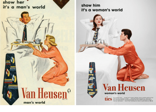
While several things on this short list are not life-threatening, they create an environment that is simply uncomfortable for women in the workplace and in their daily lives. Products such as the construction equipment, portfolio, and smartphones do not have to be an annoyance to women, but the time has not been committed to redesigning these products, despite complaints. When it comes to safety, it should be considered that women’s bodies are shaped differently than men’s, therefore they require personal protective equipment that works around these differences. Women should not be forced to drastic measures such as surgery to ensure their work equipment fits them properly.

New studies should be done, as the average height of both males and females fluctuates, and women should be included in the studies from the beginning, not simply as an afterthought. As Ely stated, design companies need to hire more women because they are often forgotten in the process.

“A woman’s place is wherever the hell she wants it to be.”

Criado-Perez, Caroline. “The deadly truth about a world built for men- from stab vests to car crashes.” The Guardian, 2019.

The One Direction Fandom as a Discourse Community

This week in class, we discussed Patricia Bizzell’s article “What is a Discourse Community?” and as I was listening to the discussion, I was thinking about a research project I completed in the spring of last year.

Bizzell defines a “discourse community” as “a group of people who share certain language-using practices” (222). While the use of distinct language is critical to defining a discourse community, there are other more subtle ways that a community can manifest. John Swales has created a list of criteria that a group must meet to be considered a discourse community (225-226):

  1. A common “goal”
  2. A “forum” accessible to all members
  3. Members provide feedback and information on the forum
  4. Shared discourse conventions or “genres”
  5. Shared, specialized language
  6. Experts and novices

In my research assignment for Advanced Composition, I analyzed the One Direction fandom and the way in which its members formed a discourse community through the creation of their online identities. As a former member of the fandom, I have an in-depth knowledge of the conventions, language, and places fans congregate.

My best friend and I before/after our One Direction concerts.

In the following diagram, I adapted the activity we did in class with a discourse community we belong to and input the appropriate data for the One Direction fandom.

The most interesting part of the fandom is that it has held up years after the separation of the band. Even after declaring a “hiatus,” the fans continue to win awards for the band as well as the boys in their solo careers. The Reddit, Twitter, and Instagram stay active with those looking to discuss memories and theories of the band’s return.

I believe the fandom meets Bizzell and Swales’ criteria to be a discourse community because of the multiple “forums” fans can speak on, the specialized language they use, and the common goal of maintaining the band’s legacy even after separation.

Nostalgia as a Rhetorical Device— Super Bowl LIV

For horror fans everywhere, the MTN Dew Zero Sugar commercial from Sunday’s Super Bowl game was the shining star. The ad directed by Tom Kuntz is the perfect promotion for the brand’s new sans-sugar soda and targets soda drinkers everywhere searching for a healthier alternative. MTN Dew made a smart marketing move by choosing three of the most iconic scenes from 1980’s The Shining: Jack Torrence ascending the stairs and breaking down the bathroom door using an axe, the blood-filled hallway, and the twin girls eerily standing at the end of the infamous hallway.

The use of these images appeals to all three of the rhetorical devices, even in viewers that have never seen the original movie. For logos, visual hierarchy plays a big role in the reception of this commercial because of the product placement.

In this first image, the MTN Dew bottle’s bright green color makes it stand out against the pale colors of the background. The bottle is an addition to the scene from the movie as Jack’s (Bryan Cranston) right hand is originally empty as he makes his way up the stairs.

In this image, Jack uses the bottle to knock on the door of the bathroom where Wendy Torrence (Tracee Ellis Ross) is hiding from her husband. Cranston holds the bottle so that the label is strategically placed outward facing toward the camera. Again, the coloring of the bottle draws audience attention to the product placed in the foreground of the image. This strategy places attention on the product rather than the scene at first glance, which allows viewers to see the true reason for the ad before returning their attention to the comedic rendition of a coveted movie.

The image most commonly associated with The Shining is the one in which Jack shoves his head through the recently destroyed door and proclaims “heeeere’s Johnny” with a maniacal expression on his face. Cranston effectively created his own rendition of the scene, but replaced the original line with “heeeere’s MTN Dew Zero Sugar” in the same tone and manner as Nicholson in the original scene.

In the final seconds of the ad, the well-known image of the identical twins (both played by Cranston) is flashed as they drink the product while eerie voices chant “zero sugar” in the background repeatedly.

The recreation of these easily recognizable scenes also appeals to pathos because long-time horror fans get a sense of nostalgia for The Shining and other movies created in the 80’s. The commercial was well-done and showcases even small elements and details from the movie that viewers noticed, which also helps boost their ethos. The attention to detail seen in the set did not go unnoticed by fans and many commented under the official video with their appreciation. One user even said, “I am going to buy Mountain Dew now because of this!” Clearly, the risk they took in recreating a famous scene paid off based on audience reactions.

Against the image of the hotel lobby being flooded with green liquid (in place of blood from the original), the tagline of the product shows on the screen: “As good as the original, maybe even better?” This line also makes the commercial relevant by toying with current conversation that followed the release of Doctor Sleep, a sequel to The Shining. People debate over the success of the movie and its cultural significance when compared with the original, much like Mountain Dew is hoping people will do with their new drink.

Which do you think is better?